One of the most common tasks in web applications is gathering user input, converting it to model objects and then validating it. This is typically referred to as data binding and every major web framework has support for this activity. In this chapter we will introduce the widgets and supporting API that implement this tasks.
Unlike many other frameworks, in Aranea request processing,
validating and data binding is not a separate part of the framework, but
just another component. Specially it is widget
org.araneaframework.uilib.form.FormWidget and some
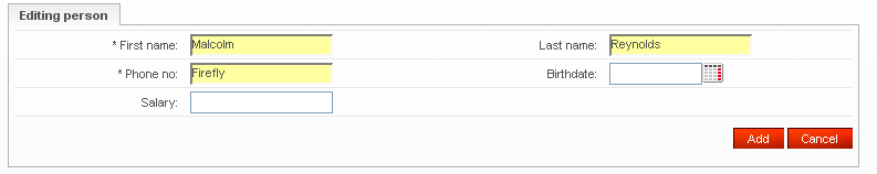
support widgets. A typical form is shown on Figure 5.1, “Form example”.
Let's say we have a Person model JavaBean that
looks like this:
public class Person {
  private Long id;
  private String name;
  private String surname;
  private String phone;

  public Long getId() {return id;}
  public void setId(Long id) {this.id = id;}

  public String getName() {return name;}
  public void setName(String name) {this.name = name;}

  public String getSurname() {return surname;}
  public void setSurname(String surname) {this.surname = surname;}

  public String getPhone() {return phone;}
  public void setPhone(String phone) {this.phone = phone;}
}
A typical form will be created and used like this:
...
private BeanFormWidget personForm;
private Person person;
...
protected void init() {
  ...
  personForm = new BeanFormWidget(Person.class);
  addWidget("personForm", personForm);

  personForm.addBeanElement("name", "#Name", new TextControl(new Long(3), null), true);
  personForm.addBeanElement("surname", "#Last name", new TextControl(), true);
  personForm.addBeanElement("phone", "#Phone no", new TextControl(), true);
  ...
  person = lookupPersonService().getSomePerson();
  personForm.readFromBean(person);
  ...
}
...
Note that here we basically do three things:
- Create and register the form
-
The line
new BeanFormWidget(Person.class)creates a new form widget that is associated with the JavaBean model classPerson. The lineaddWidget("personForm", personForm)initializes and registers the form allowing it to function. - Add form fields
-
The line
personForm.addBeanElement("name", "#Name", new
              TextControl(new Long(3), null), true)
adds an element associated with the JavaBean property "name" (this is also the identifier of the field), with a label "Name" (labels in Aranea are localizable by default and "#" escapes a non-localizable string), a text box control with a minimal length of 3 and that is mandatory. - Write JavaBean
-
The line
personForm.readFromBean(person)reads the data from JavaBean properties to the corresponding form fields.
Now that we have created the form we show how to process events, validate and read the request data. The following example code should be in the same widget as the previous:
...
private void handleEventSave() {
  if (personForm.convertAndValidate()) {
   personForm.writeToBean(person);
   ...
   lookupPersonService()().savePerson(person);
  }
}
...
This code will execute if an event "save" comes and will do the following:
-
Convert the request data to the JavaBean types and validate it according to the rules specified in controls (e.g. minimal length). Wrapping event body in
if (personForm.convertAndValidate()) {...}is a generic idiom in Aranea as we believe that explicitly leads to flexibility. By default the values will be just read from request without any parsing, conversion or validation and the latter will be done only after theconvertAndValidate()call. This allows for example to validate only a subform or even one element, by calling only theirconvertAndValidate()method. -
Read the
personobject from the form, filling it in with the user data. Note that the same object that was originally read from the business layer is used here and forms take care of merging the new data and preserving the old.
Note the use of the getValueByFullName()
method. Form API contains several such methods (named
*ByFullName()), which allow to access fields,
controls and values using full dot-separated element names.
If you have a composite JavaBean (containing other JavaBeans) you
may want to create a form with a similar structure. Let's say that our
Person bean contains an Address
under "address" JavaBean property:
...
personForm = new BeanFormWidget(Person.class);
addWidget("personForm", personForm);
...
BeanFormWidget addrForm = personForm.addBeanSubForm("address");
addrForm.addBeanElement("postalCode", "#Postal code", new TextControl(), true);
addrForm.addBeanElement("street", "#Street", new TextControl(), true);
...
Note that the fields will be available from the main form using a
dot-separated name, e.g. String street = (String)
personForm.getValueByFullName("address.street").
At the core of the data binding API lies the notion of
controls
(org.araneaframework.uilib.form.Control). Controls
are the widgets that do the actual parsing of the request parameters and
correspond to the controls found in HTML forms, like textbox, textarea,
selectbox, button, ... Additionally controls also do a bit of validating
the submitted data. For example textbox control validates the minimum
and maximum string length, since the HTML tag can do the same.
Programmer usually does not read values from Control
directly, but from FormElement that takes care of
converting value of Control to
FormElement Data.
The following example shows how to create a control:
...
TextControl textBox = new TextControl(new Long(10), null);
...
This code will create a textbox with a minimal length of 10. Note that this code does not yet put the control to work, as controls are never used without forms, which are reviewed in the next section.
Follows a table of standard controls all found in
org.araneaframework.uilib.form.control package:
| Control | Description |
|---|---|
ButtonControl | A control that represents a HTML form button. |
CheckboxControl | A control that represents a binary choice and is usually rendered as a checkbox. |
DateControl | A date selection control that allows to choose a date. Supports custom formats of date input and output. |
DateTimeControl | A date and time selection control that allows to choose a date with a corresponding time. Supports custom formats of date and time input and output. |
DisplayControl | A control that can be used to render a read-only value that will not be submitted with an HTML form. |
FileUploadControl | A control that can be used to upload files to the server. |
FloatControl | A textbox control that constrains the text to be floating-point numbers. Can also check the allowed minimum and maximum limits. |
HiddenControl | A control that can be used to render an invisible value that will be submitted with an HTML form. |
NumberControl | A textbox control that constrains the text to be integer numbers. Can also check the allowed minimum and maximum limits. |
TimeControl | A time selection control that allows to choose a time of day. Supports custom formats of time input and output. |
TextareaControl | A multirow textbox control that can constrain the inserted text minimal and maximal length. |
TextControl | A simple textbox control with one row of text that can constrain the inserted text minimal and maximal length. |
AutoCompleteTextControl | TextControl with autocompletion
capability. |
TimestampControl | Similar to DateControl but works
with java.sql.TimeStamp. |
SelectControl | A control that allows to select one of many choices (may be rendered as a dropdown list or option buttons). Ensures that the submitted value was one of the choices. |
MultiSelectControl | A control that allows to select several from many choices (may be rendered as a multiselect list or checkbox list). Ensures that the submitted values are a subset of the choices. |
SelectControl and
MultiSelectControl deserve a special mention, as they
need a bit more handling than the rest. The difference comes from the
fact that we also need to handle the selectable options, which we refer
to as DisplayItem. Each
DisplayItem has a label, a string value and can be
disabled. Disabled display items cannot be selected in neither select
box nor multiselect box.
Both SelectControl and
MultiSelectControl implement the
DisplayItemContainer interface that allows to
manipulate the DisplayItem:
interface DisplayItemContainer {
  void addItem(DisplayItem item);
  void addItems(Collection items);
  void clearItems();
  List getDisplayItems();
  int getValueIndex(String value);
}
In addition to this interface we also provide a
DisplayItemUtil that provides some support methods on
display items. These include the method
addItemsFromBeanCollection that allows to add the
items to a (multi)select control from a business method returning a
collection of model JavaBean objects (which is one of the most common
use cases). So a typical select control will be filled as
follows:
SelectControl control = new SelectControl();
control.addItem(new DisplayItem(null, "- choice -"));
DisplayItemUtil.addItemsFromBeanCollection(
  control,
  lookupMyService().getMyItemCollection(),
  "value",
  "label");
Controls can also listen to user events. For example
ButtonControl can react to an
onClick event, while most others can react to an
onChange event. The only thing needed to receive the
control events is to register an appropriate event listener:
...
SelectControl selControl = new SelectControl();
FormElement selEl = form.addBeanElement("clientId", "#Client id", selControl, true);
selControl.addOnChangeEventListener(new OnChangeEventListener() {
  public void onChange() {
    //We convert and validate one element only as the rest of the form
    //might be invalid
    if (selEl.convertAndValidate()) {
      Long clientId = (Long) selEl.getValue();
      //Now we can use the client id to do whatever we want
      //E.g. update another select control
    }
  }
});
...
onChange events are also produced by text boxes
and similar, so the user input can processed right after the user has
finished it.
Though controls provide some amount of validation they are limited
only to the rules that can be controlled on the client-side. To support
more diverse rules Aranea has
org.araneaframework.uilib.form.Constraint, that
allows to put any logical and/or business validation rules. Typically
constraints are used as follows:
...
myForm.addBeanElement("registration", "#Registration", new DateControl(), true);
myForm.getElement("registration").setConstraint(new AfterTodayConstraint(false));
...
The
org.araneaframework.uilib.form.constraint.AfterTodayConstraint
makes sure that the date is today or later, with the boolean parameter
indicating whether today is allowed. The constraint will validate if the
form or the element in question is validated (e.g.
convertAndValidate() is called) and will show an
error message to the user, if the constraint was not satisfied. The
error message is customizable using localization and involves the label
of the field being validated.
The following is a more complex example that shows how to use constraints that apply to more than one field, and how to combine constraints using logical expressions:
...
searchForm = new FormWidget();

//Adding form controls
searchForm.addElement("clientFirstName", "#Client first name",
  new TextControl(), new StringData(), false);
searchForm.addElement("clientLastName", "#Client last name",
  new TextControl(), new StringData(), false);

searchForm.addElement("clientAddressTown", "#Town",
  new TextControl(), new StringData(), false);
searchForm.addElement("clientAddressStreet", "#Street",
  new TextControl(), new StringData(), false);

//First searching scenario
AndConstraint clientNameConstraint = new AndConstraint();
clientNameConstraint.addConstraint(
  new NotEmptyConstraint(searchForm.getElementByFullName("clientFirstName")));
clientNameConstraint.addConstraint(
  new NotEmptyConstraint(searchForm.getElementByFullName("clientLastName")));

//Second searching scenario
AndConstraint clientAddressConstraint = new AndConstraint();
clientAddressConstraint.addConstraint(
  new NotEmptyConstraint(searchForm.getElementByFullName("clientAddressTown")));
clientAddressConstraint.addConstraint(
  new NotEmptyConstraint(searchForm.getElementByFullName("clientAddressStreet")));

//Combining scenarios
OrConstraint searchConstraint = new OrConstraint();
searchConstraint.addConstraint(clientNameConstraint);
searchConstraint.addConstraint(clientAddressConstraint);

//Setting custom error message
searchConstraint.setCustomErrorMessage("Not enough data for search!");

//Setting constraint
searchForm.setConstraint(searchConstraint);

//Putting the widget
addWidget("searchForm", searchForm);
...
The example use case is a two scenario search—either both client
first name and client last name fields are filled in or both town and
street address fields are filled in, otherwise an error message "Not
enough data for search!" is shown. The constraints will be validated
when convertAndValidate() method is called on
searchForm. Note that the constraint is added to the
form itself, rather than to its elements—this is a typical idiom, when
the constraint involves several elements.
Table of standard Constraints.
| Constraint | Purpose |
|---|---|
AfterTodayConstraint | Field constraint, checks that field contains
Date later than current date. |
NotEmptyConstraint | Field constraint, checks that field contains non-empty value. |
NumberInRangeConstraint | Field constraint, checks that number in a field belongs on given range (integer only). |
StringLengthInRangeConstraint | Field constraint, checks that length of a string in a field falls within given boundaries. |
RangeConstraint | Multiple field constraint, checks that value of one
field is lower than value of other field. Field values must
Comparable. |
AndConstraint | Composite constraint, checks that all subconstraints are satisfied. |
OrConstraint | Composite constraint, checks that at least one subconstraint is satisfied. |
There are two constraints that deserve a special mention. One of
them is OptionalConstraint that will only let its
subconstraint to validate the field, if the field has been submitted by
user (it is very useful for instance when non-mandatory fields must
nevertheless follow some pattern, whereas empty input should still be
allowed).
The other constraint is called
GroupedConstraint. It is useful in cases when
different constraints should be activated depending on the particular
state of the component (a typical use case is that some groups of fields
are made mandatory in different states of document approval). The
constraint is created using the ConstraintGroupHelper
as follows:
...
ConstraintGroupHelper groupHelper = new ConstraintGroupHelper();
AndConstraint andCon = new AndConstraint();
andCon.addConstraint(
  groupHelper.createGroupedConstraint(new NotEmptyConstraint(field1), "group1"));
andCon.addConstraint(
  groupHelper.createGroupedConstraint(new NotEmptyConstraint(field2), "group1"));
andCon.addConstraint(
  groupHelper.createGroupedConstraint(new NotEmptyConstraint(field3), "group2"));
andCon.addConstraint(
  groupHelper.createGroupedConstraint(new NotEmptyConstraint(field4), "group2"));
form.setConstraint(andCon);

//Now only field1 and field2 will be required from user!
groupHelper.setActiveGroup("group1");
...
It is a very common need to validate some additional logic for a
particular field (e.g. a field must follow some particular pattern).
In this case it is comfortable to create a custom constraint. Most
often the constraint is associated with one field only, so we will
extend the BaseFieldConstraint, which supports this
particular idiom:
...
public class PersonIdentifierConstraint extends BaseFieldConstraint {
  public void validateConstraint() {
    if (!PersonUtil.validateIdentifier(getValue()) {
      addError("Field '" + getLabel() + "' is not a valid personal identifier");
    }
  }
}
...
Note that we can use getValue() that contains
the converted value of the field. We can also use the fields label via
getLabel(). We might also want to localize the
message and in such a case you will find
MessageUtil to contain some helpful methods.
If we need to validate more than one field we should extend the
BaseConstraint and take those fields into the
constructor. In this case the developer will have to provide this
fields to the constraint and the constraint should be added to the
enclosing form.
The typical use of forms includes associating the form fields with
JavaBean properties. However this is not always possible, since it is
not feasible to make a JavaBean property for each and every form field.
In such cases one may still want to use type conversion and data
validation. To do that forms allow the
org.araneaframework.uilib.form.Data and its
subclasses (subclasses correspond to specific types) to be associated
with the field:
...
personForm = new BeanFormWidget(Person.class);
addWidget("personForm", personForm);
...
personForm.addElement("numberOfChildren", "#No. of chidren",
  new NumberControl(), new LongData(), true);
...
In such a case one can retrieve the data directly from the field:
...
private void handleEventSave() {
  if (myForm.convertAndValidate()) {
    ...
    Long numberOfChildren = (Long) personForm.getValueByFullName("numberOfChildren");
    //Alternative:
    //FormElement nocEl = (FormElement) personForm.getElement("numberOfChildren");
    //Long numberOfChildren = (Long) nocEl.getValue();
    ...
  }
}
...
If there is no JavaBean to associate the form with
org.araneaframework.uilib.form.FormWidget may be used
instead of BeanFormWidget.
Note that the reason for existence of Data
objects is that Java types correspond poorly to some restricted
types—for instance enumerations, type encodings and collections
container types (this problem is somewhat solved in Java 5, but Aranea
is compatible with Java 1.3).
Table of Data types.
| Data | Value Type |
|---|---|
BigDecimalData | java.math.BigDecimal |
BigDecimalListData | List
<java.math.BigDecimal> |
BooleanData | java.lang.Boolean |
BooleanListData | List
<java.lang.Boolean> |
DateData | java.util.Date |
DisplayItemListData | List
<org.araneaframework.uilib.support.DisplayItemDisplayItem> |
FileInfoData | org.araneaframework.uilib.support.FileInfo |
IntegerData | java.lang.Integer |
IntegerListData | List
<java.lang.Integer> |
LongData | java.lang.Long |
LongListData | List <java.lang.Long> |
StringData | java.lang.String |
StringListData | List
<java.lang.String> |
TimestampData | java.sql.Timestamp |
YNData | java.lang.String |
Finally Data constructor also accepts both a
Class instance and a simple string. So if you have a
custom datatype with an appropriate converter (see next section) you can
just assign the data with the same type (in fact if you have your own
converter the type doesn't matter that much, it will just allow some
checks to be done on the programmer).
Converter sole purpose is conversion of values with one type to
values of another type. Conventionally converter which
convert() method accepts object of type
A and returns object of type B
is named AToBConverter. Converter from type
B to type A is obtained with
new ReverseConverter(new AToBConverter()).
public interface Converter extends Serializable, FormElementAware {
    public void setFormElementCtx(FormElementContext feCtx);
    public Object convert(Object data);
    public Object reverseConvert(Object data);
    public Converter newConverter();
}
Converters are used internally to convert
Control values to values of
FormElement Data and vice-versa.
Converters are usually looked up from
ConverterFactory, but each
FormElement can be set explicit
Converter by calling
FormElement.setConverter(). Direction of
Converter set this way should be from
FormElement Control value type to
FormElement Data type.
As already mentioned, form validation is mostly explicit. By default, the values will be just read from
request without any parsing, conversion or validation. Validation will be performed after call to
FormWidget.convertAndValidate().
It is also possible to configure forms to be validated in the background, as end-user is filling it.
Background validation is enabled by calling FormWidget.setBackgroundValidation(true). This
performs XMLHttp requests (using Aranea Action API) to server each time when user moves from changed form field
to another. Background validation takes place on server-side and is implicit.
Produced form validation error messages are rendered by active FormElementValidationErrorRenderer
implementation, which adheres to these methods:
public interface FormElementValidationErrorRenderer extends Serializable {

  void addError(FormElement element, String error);

  void clearErrors(FormElement element);

  String getClientRenderText(FormElement element);

}
The last method is used to provide the client-side script (together with
<script>...</script> tags) that binds its validator with the given
form element and updates error messages inside the <span> element of the given form element.
It is possible to choose between two bundled implementations —
StandardFormElementValidationErrorRenderer, which is enabled by default, and
LocalFormElementValidationErrorRenderer. The first one renders
FormElement validation errors to standard MessageContext.
The second bundled implementation renders the validation messages into the same HTML
span element as input field (using the script returned by the
getClientRenderText(FormElement) method).
FormElementValidationErrorRenderer default implementation can be switched by configuring the
bean representing ConfigurationContext (named 'araneaConfiguration')
to have entry with key 'uilib.widgets.forms.formelement.error.renderer' value set to desired
FormElementValidationErrorRenderer instance:
<bean id="araneaConfiguration" singleton="false"
    class="org.araneaframework.uilib.core.StandardConfiguration">
  <property name="confEntries">
    <map>
      <entry key="uilib.widgets.forms.formelement.error.renderer"
        value="org.araneaframework.uilib.form.LocalFormElementValidationErrorRenderer"/>
    </map>
  </property>
</bean>
For the cases where validation errors should be rendered differently for just few elements,
FormElement.setFormElementValidationErrorRenderer() method should be used.
Form JSP tags can be divided into two categories—tags providing contexts (<ui:form>, <ui:formElement>) and tags for rendering form elements containing different controls. We will first describe the attributes that are common to all form element rendering tags; then proceed to explain context tags and different form element rendering tags with their unique attributes.
| Attribute | Required | Description |
|---|---|---|
| id | no/yes | Id of form element to be rendered. If not specified, it is usually taken from current form element context (Section 5.2.3, “<ui:formElement>”). For few tags, it is required. |
| events | no | Whether element will send events that are registered by
server-side, true by default. |
| validateOnEvent | no | Whether the form should be validated on the client-side
(or by making AJAX request to server) when element
generates an event (this is false
by default and is not supported by any default Aranea JSP
tags). |
| tabindex | no | This attribute specifies the position of the current element in the tabbing order for the current document. This value must be a number between 0 and 32767. |
| updateRegions | no | Comma separated list of update regions that should be updated upon button receiving event. This attribute is only needed when using AJAX features— ordinary HTTP requests always update whole page. |
| globalUpdateRegions | no | Comma separated list of global update regions that should be updated upon button receiving event. This attribute is only needed when using AJAX features— ordinary HTTP requests always update whole page. |
| styleClass | no | CSS class applied HTML tag(s) that are used for rendering element. |
| style | no | Inline CSS style applied to HTML tag(s) that are used for rendering element. |
Specifies form context for inner tags. Form view model and id are made accessible to inner tags as EL variables.
| Attribute | Required | Description |
|---|---|---|
| id | no | Id of context form. When not specified, current form context is preserved (if it exists). |
| Variable | Description | Type |
|---|---|---|
| form | View model of form. | FormWidget.ViewModel |
| formId | Id of form. | String |
| formFullId | Full id of form. | String |
| formScopedFullId | Full scoped id of form. | String |
Specifies form element context for inner tags. Must be surrounded by <ui:form> tag. Form element view model, id and value are made accessible to inner tags as EL variables.
| Variable | Description | Type |
|---|---|---|
| formElement | View model of form element. | FormElement.ViewModel |
| formElementId | Id of form element. | String |
| formElementValue | Value currently kept inside form element. | Object |
Renders localizable label bound to form element. Rendered with HTML <span> and <label> tags.
| Attribute | Required | Description |
|---|---|---|
| id | no | Id of form element which label should be rendered. If left unspecified, form element id from form element context is used. |
| showMandatory | no | Indicates whether mandatory input fields label is
marked with asterisk. Value should be true
or false, default is
true |
| showColon | no | Indicates whether colon is shown after the label.
Default is true. |
style and styleClass attributes.Renders localizable label (with HTML <span> and <label> tags).
| Attribute | Required | Description |
|---|---|---|
| labelId | yes | ID of label to render. |
| showMandatory | no | Indicates whether label is marked with asterisk. Value
should be true or false,
default is false |
| showColon | no | Indicates whether colon is shown after the label.
Default is true. |
| for | no | ID of the form element for which the label is created. |
style and styleClass attributes.Renders form buttons that represent
ButtonControls. Either HTML <button> or
<input type="button" ... > will be used for rendering.
| Attribute | Required | Description |
|---|---|---|
| showLabel | no | Indicates whether button label is shown.Value should be
true or false, default
is true |
| onClickPrecondition | no | Precondition for deciding whether onclick event should
go server side or not. If left unspecified, this is considered
to be true. |
| renderMode | no | Allowed values are button and
input—the corresponding HTML tag will be
used to render the button. Default is button. |
Renders HTML link that represents
ButtonControl. HTML <a href="javascript:" ... >
tag will be used for rendering. Default
styleClass="aranea-link".
| Attribute | Required | Description |
|---|---|---|
| showLabel | no | Indicates whether button label is shown.Value should be
true or false, default
is true |
| onClickPrecondition | no | Precondition for deciding whether registered onclick
event should go server side or not. If left unspecified, this
is considered to be true. |
Registers a simple keyboard handler. Invokes a
uiRegisterKeyboardHandler javascript. This is
basically the same stuff as <ui:keyboardHandler> with a few
modifications.
There is no scope attribute. Instead, the tag
assumes that it is located inside a form, and takes the full id of that
form as its scope.
As an alternative to specifying the handler
attribute, you may specify a form element and a javascript event to
invoke on that element. You specify the element by its id relative to
the surrounding form. The event is given as a name of the javascript
function to be invoked on the element. For example, if you specify the
element as "someButton", and event as "click", then when the required
keyboard event occurs, the following javascript will be executed:
var el = document.getElementById("<form-id>.someButton");
el.click();
| Attribute | Required | Description |
|---|---|---|
| handler | no | A javascript handler function that takes two parameters
- the event object and the element id for which the event was
fired. Example: function(event, elementId) {
alert(elementId); } Either handler or
elementId/event pair should be specified, not both. |
| subscope | no | Specifies form element which is the scope of this
handler. By default the "scope" (as in
<ui:keyboardHandlerTag>) of this
keyboard handler is the form inside which the handler is
defined. By specifying this, scope of certain element may be
narrowed. For example if the handler is defined inside form
"myForm", and subscope is specified as "myelement", the scope
of the handler will be "myForm.myelement", not the default
"myForm". The handler will therefore be active only for the
element 'someElement'". |
| elementId | no | Sets the (relative) id of the
element whose javascript event should be invoked. The
id is relative with respect to the
surrounding form. Instead of this attribute, element's full id
may be set using the fullElementId
attribute, but only one of those attributes should be set at
once. |
| fullElementId | no | Sets the full id of the element
whose javascript event should be invoked. |
| event | no | Set the javascript event that should be invoked when
keypress is detected—"click" and "focus" are safe for most
controls. If target element (the one given by
elementId) is a selectbox "select" may be
used. For more, javascript reference should be consulted. This
attribute is not foolproof and invalid javascript may be
produced when it is not used cautiously. |
| keyCode | no | Keycode to which the event must be triggered. Either keyCode or key must be specified, but not both. |
| key | no | Key to which the event must be triggered, accepts key
"aliases" instead of codes. Accepted aliases include
F1..F12, RETURN, ENTER, BACKSPACE, ESCAPE, TAB,
                SHIFT, CONTROL, SPACE
. |
Same as <ui:formKeyboardHandlerTag>
except key is already set to
enter.
Same as <ui:formKeyboardHandlerTag>
except key is already set to
escape.
Form text input field, represents TextControl.
It is rendered in HTML with <input type="text"
...> tag. Default
styleClass="aranea-text".
| Attribute | Required | Description |
|---|---|---|
| size | no | Maximum length of accepted text (in characters). |
| onChangePrecondition | no | Precondition for deciding whether registered onchange
event should go server side or not. If left unspecified, this
is considered to be true. For this tag,
onchange event is simulated with
onblur. |
Form text input field, represents
AutoCompleteTextControl. It is rendered in HTML with
<input type="text"
      ...>
tag. Default
styleClass="aranea-text". It is able to make
background AJAX request to the server, fetching suggested completions to
user input and displaying these to the user.
| Attribute | Required | Description |
|---|---|---|
| size | no | Maximum length of accepted text (in characters). |
| onChangePrecondition | no | Precondition for deciding whether registered onchange
event should go server side or not. If left unspecified, this
is considered to be true. For this tag,
onchange event is simulated with
onblur. |
| divClass | no | CSS class attribute assigned to <DIV> inside which suggestions are presented. |
Form text input field, represents ComboTextControl.
This is an input field combined with Select—it allows end-user to enter text
into field or select some predefined value from provided list of values.
It is rendered in HTML with <input type="text"
...> tag plus custom select component. Default
styleClass="aranea-text".
| Attribute | Required | Description |
|---|---|---|
| size | no | Maximum length of accepted text (in characters). |
| onChangePrecondition | no | Precondition for deciding whether registered onchange
event should go server side or not. If left unspecified, this
is considered to be true. For this tag,
onchange event is simulated with
onblur. |
Form text display field, represents
TextControl. It is rendered in HTML with
<span ...> tag. Default
styleClass="aranea-text-display".
Form number input field, represents
NumberControl. It is rendered in HTML with
<input type="text" ...> tag. Default
styleClass="aranea-number".
| Attribute | Required | Description |
|---|---|---|
| size | no | Maximum length of accepted text (in characters). |
| onChangePrecondition | no | Precondition for deciding whether registered onchange
event should go server side or not. If left unspecified, this
is considered to be true. For this tag,
onchange event is simulated with
onblur. |
Form number display field, represents
NumberControl. It is rendered in HTML with
<span
      ...>
tag. Default
styleClass="aranea-number-display".
Form floating-point number input field, represents
FloatControl. It is rendered in HTML with
<input type="text" ...> tag. Default
styleClass="aranea-float".
| Attribute | Required | Description |
|---|---|---|
| size | no | Maximum length of accepted floating-point number (in characters). |
| onChangePrecondition | no | Precondition for deciding whether registered onchange
event should go server side or not. If left unspecified, this
is considered to be true. For this tag,
onchange event is simulated with
onblur. |
Form floating-point number display field, represents
FloatControl. It is rendered in HTML with
<span ...> tag. Default
styleClass="aranea-float-display".
Form number input field, represents
TextControl. It is rendered in HTML with
<input type="password" ...> tag. Default
styleClass="aranea-text".
| Attribute | Required | Description |
|---|---|---|
| size | no | Maximum length of password (in characters). |
| onChangePrecondition | no | Precondition for deciding whether registered onchange
event should go server side or not. If left unspecified, this
is considered to be true. For this tag,
onchange event is simulated with
onblur. |
Form text display field, represents
DisplayControl, displays element value as
String. It is rendered in HTML with <span
...> tag.
Puts form element value in page scope variable, represents
DisplayControl. It does not output any HTML.
Form text input area, represents
TextareaControl. It is rendered in HTML with
<textarea ...> tag. Default
styleClass="aranea-textarea".
| Attribute | Required | Description |
|---|---|---|
| cols | true | Number of visible columns in textarea. |
| rows | true | Number of visible rows in textarea. |
Form text input area, represents
TextareaControl. It is rendered in HTML with
<textarea ...> tag with
styleClass="richTextEditor". The area is displayed as
a rich text editor. The configuration of the editor is done via
<ui:richTextAreaInit>. The tag shares all the
attributes of the <ui:textarea> except the
styleClass which cannot be set for this tag.
A tag for configuring the rich textareas. The tinyMCE WYSIWYG editor is
attached to the textareas defined via
<ui:richTextarea> . The configuration lets you
choose the looks, buttons, functionality of the editor. See tinyMCE
configuration reference for different configurable
options.
The configuration is done via nesting key value pairs inside the
<ui:richTextAreaInit>. For the key value pairs the
<ui:attribute> tag is used. See the example for
an overview.
The editor_selector and mode
options are set by default and should not be changed. The default
theme is "simple".
Important: the configuration should be done
in the <head> section of the HTML
document.
<ui:richTextAreaInit>
  <ui:attribute name="theme" value="advanced"/>
  <ui:attribute name="theme_advanced_buttons1" value="bold,italic,underline,separator,code"/>
  <ui:attribute name="theme_advanced_toolbar_location" value="top"/>
  <ui:attribute name="theme_advanced_toolbar_align" value="left"/>
  <ui:attribute name="theme_advanced_path_location" value="bottom"/>
</ui:richTextAreaInit>
Form text display area, represents
TextareaControl. It is rendered in HTML with
<span ...> tag. Default
styleClass="aranea-textarea-display".
| Attribute | Required | Description |
|---|---|---|
| escapeSingleSpaces | false | Boolean, specifying whether even single spaces (blanks) should be replace with entities in output. It affects
browser performed text-wrapping. Default value is false.
Attribute is available since tag-library version 1.0.6. |
id and
styleClass attributes.Represents a "hidden" form input
element—HiddenControl. It is rendered in HTML with
<input type="hidden" ...> tag.
Form checkbox input field, represents
CheckboxControl. By default
styleClass="aranea-checkbox". Rendered in HTML with
<input type="checkbox" ...> tag.
| Attribute | Required | Description |
|---|---|---|
| onChangePrecondition | no | Precondition for deciding whether registered onchange
event should go server side or not. If left unspecified, this
is considered to be true |
Form checkbox display field, represents
CheckboxControl. By default
styleClass="aranea-checkbox-display". Rendered in
HTML inside <span> tag.
Form file upload field, represents
FileUploadControl.
Form date input field, represents DateControl.
Default styleClass="aranea-date".
| Attribute | Required | Description |
|---|---|---|
| onChangePrecondition | no | Precondition for deciding whether registered onchange
event should go server side or not. If left unspecified, this
is considered to be true. |
Form date display field, represents
DateControl. Default
styleClass="aranea-date-display".
Form time input field, represents TimeControl.
Default styleClass="aranea-time". HTML <select>s for easy hour/minute selection
are rendered too, unless showTimeSelect attribute forbids it.
| Attribute | Required | Description |
|---|---|---|
| onChangePrecondition | no | Precondition for deciding whether registered onchange
event should go server side or not. If left unspecified, this
is considered to be true. |
| showTimeSelect | no |
Boolean, specifying whether HTML <select>'s should be rendered for easy hour/minute selection.
Default is to render them (true).
|
Form time display field, represents
TimeControl. Default
styleClass="aranea-time-display".
Form input field for both date and time, represents
DateTimeControl. It is rendered as input fields for date and time + date picker and
time picker (time picker can be switched off by setting showTimeSelect="false" if so desired).
| Attribute | Required | Description |
|---|---|---|
| onChangePrecondition | no | Precondition for deciding whether registered onchange
event should go server side or not. If left unspecified, this
is considered to be true. |
| showTimeSelect | no |
Boolean, specifying whether HTML <select>'s should be rendered for easy hour/minute selection.
Default is to render them (true).
|
| dateStyleClass | no | styleClass for date. Default is "aranea-date". |
| timeStyleClass | no | styleClass for time. Default is "aranea-time". |
Form display field for both date and time, represents
TimeControl. Default
styleClass="aranea-datetime-display".
Form dropdown list input field, represents
SelectControl. Default
styleClass="aranea-select", rendered with HTML
<select ...> tag.
| Attribute | Required | Description |
|---|---|---|
| onChangePrecondition | no | Precondition for deciding whether registered onchange
event should go server side or not. If left unspecified, this
is considered to be true. |
| size | no | Number of select elements visible at once. |
Form select display field, represents
SelectControl. Default
styleClass="aranea-select-display", rendered with
HTML <span ...> tag.
Form list input field, represents
MultiSelectControl. Default
styleClass="aranea-multi-select", rendered with HTML
<select multiple="true" ...> tag.
| Attribute | Required | Description |
|---|---|---|
| size | no | Vertical size, number of options displayed at once. |
Form multiselect display field, represents
MultiSelectControl. Default
styleClass="aranea-multi-select-display", rendered
with HTML <span ...> tag.
Form radioselect buttons field, represents
SelectControl. Default
styleClass="aranea-radioselect". It takes care of
rendering all its elements; internally using
<ui:radioSelectItemLabel> and <ui:radioSelectItem>
tags.
| Attribute | Required | Description |
|---|---|---|
| type | no | The way the radio buttons will be rendered - can be either vertical or horizontal. By default "horizontal". |
| labelBefore | no | Boolean that controls whether label is before or after
each radio button, false by
default. |
Form radio button, represents one item from
SelectControl. Default
styleClass="aranea-radio". It will be rendered with
HTML <input type="radio" ...> tag.
| Attribute | Required | Description |
|---|---|---|
| value | no | The value of this radio button that will be submitted with form if this radio button is selected. |
| onChangePrecondition | no | Precondition for deciding whether registered onchange
event should go server side or not. If left unspecified, this
is considered to be true. |
Form radio button label, represents label of one item from
SelectControl. It will be rendered with HTML
<span ...> tag.
| Attribute | Required | Description |
|---|---|---|
| value | no | Select item value. |
| showMandatory | no | Indicates whether label for mandatory input is marked
with asterisk. Value should be true or
false, default is
true. |
| showColon | no | Indicates whether colon is shown between the label and
value. Default is true |
id and
styleClass attributes.Form multiselect checkbox field, represents
MultiSelectControl. It takes care of rendering all
its elements; internally using <ui:checkboxMultiSelectItemLabel>
and <ui:checkboxMultiSelectItem> tags.
| Attribute | Required | Description |
|---|---|---|
| type | no | The way the checkboxes will be rendered - can be either vertical or horizontal. Default is horizontal. |
| labelBefore | no | Boolean that controls whether label is before or after
each cehckbox, false by default. |
Form radio button, represents one item from
MultiSelectControl. Default
styleClass="aranea-multi-checkbox". It will be
rendered with HTML <input type="checkbox" ...>
tag.
| Attribute | Required | Description |
|---|---|---|
| value | no | The value of this checkbox that will be submitted with form if this checkbox is selected. |
Form checkbox label, represents label of one item from
MultiSelectControl. It will be rendered with HTML
<span ...> tag.
| Attribute | Required | Description |
|---|---|---|
| value | no | Select item value. |
| showMandatory | no | Indicates whether label for mandatory input is marked
with asterisk. Value should be true or
false, default is
true. |
| showColon | no | Indicates whether colon is shown between the label and
value. Default is true |
id and
styleClass attributes.Depending whether form element boolean value is
true or false display one or
other content, represents DisplayControl.
<ui:conditionFalse> and
<ui:conditionFalse> tags must be used inside
this tag to define alternative contents. This tag itself is not
rendered.
The content of this tag will be displayed when form element of
surrounding <ui:conditionalDisplay> was
false. Tag has no attributes.
The content of this tag will be displayed when form element of
surrounding <ui:conditionalDisplay> was
true. Tag has no attributes.
Display form element value as list of strings, represents
DisplayControl and requires that element value would
be of type Collection.
Sometimes the type of FormElement is not known
for sure when writing JSP (it could be textInput,
floatInput, select, ...). For that
purpose, FormElement that has some known identifier
can be dynamically associated with some JSP tag in Java code and then
rendered with <ui:automaticFormElement> tag
which uses associated tag to render
FormElement.
In Java code, setting tag that should rendering element is done
by either setting FormElement property or preferably by using AutomaticFormElementUtil
utility which makes the code slightly less verbose. Following lines of code all do the same thing:
element.setProperty(FormElementViewSelector.FORM_ELEMENT_VIEW_SELECTOR_PROPERTY, new FormElementViewSelector(tag, attributes));
AutomaticFormElementUtil.setFormElementViewSelector(element, new FormElementViewSelector(tag, attributes));
AutomaticFormElementUtil.setFormElementTag(element, tag, attributes);
<?xml version="1.0" encoding="UTF-8"?>
<ui:formElement id="someForm">
  <ui:cell>
    <ui:automaticFormElement/>
  </ui:cell>
</ui:formElement>
A common need in handling data is allowing a user to list of data,
where the number of rows is not known beforehand (a typical example being
user inputting one to many addresses). Aranea supports such a use case by
providing a special type of FormElement that deals an
arbitrary amount of subforms. This element is called
FormListWidget and it can be used both on its own or as
a subelement just like a FormWidget. An example of a
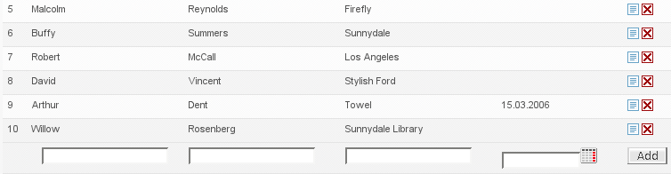
form list is shown on Figure 5.2, “Insert your name display”.
Unlike usual forms, form lists are "lazy", from the point that they are tied to a model and update themselves according to it. To create a form list widget we pass it a model and a handler:
...
  public void init() throws Exception {
    private FormListWidget personFormList;
    ...
    Map persons = lookupMyService().getPersons();

    personFormList = new BeanFormListWidget(
        new PersonFormRowHandler(),
        new MapFormListModel(persons),
        Person.class);

    addWidget("personFormList", personFormList);
  }
...
Note here that we have tied the form list to the model that uses a
Map as the underlying storage. When we update that
map, the form list will also be updated. Note also that the form list
widget is associated with the Person bean class,
which can be used to manipulate the beans under the model.
However this code doesn't yet tell us much. The bulk of the custom
logic of the form lists is hidden in the
PersonFormRowHandler class. Let's inspect it step by
step.
Every form row handler must implement the
FormRowHandler interface. In our case we choose to
extend ValidOnlyIndividualFormRowHandler, which
processes only valid form rows and allows to process them one by one,
not all at once:
class PersonFormRowHandler
  extends ValidOnlyIndividualFormRowHandler {
  ...
}
The first method we have to implement is
getRowKey. It is used by the form list widget to
identify the row among the others. Since typically the row is just a
bean we can identify it using its identifier (either a natural one or
artificial, as long as its unique in this context):
...
public Object getRowKey(Object rowData) {
  return ((Person) rowData).getId();
}
...
The next method is called initAddForm and it
will create a form used to add new rows to the form list:
...
public void initAddForm(FormWidget addForm) throws Exception {
  addForm.addBeanElement("name", "#First name", new TextControl(), true);
  addForm.addBeanElement("surname", "#Last name", new TextControl(),  true);
  addForm.addBeanElement("phone", "#Phone no", new TextControl(), false);

  FormListUtil.addAddButtonToAddForm("#", formList, addForm);
}
...
The bulk of the logic is just adding the fields to the add form.
But we also use the FormListUtil to add a button
"Add" to the form, that will take care of the actual adding a new row
(or at least calling the form row handler to do that).
FormListUtil contains a lot of helpful methods for
manipulating form lists and more on it can be found in Section 5.3.2, “FormListUtil”. The next step would be to handle the user
clicking the add button and add a new row to the model. Since we process
only valid rows the method will be named
addValidRow:
...
public void addValidRow(FormWidget addForm) throws Exception {
  Person person = (Person) (((BeanFormWidget)addForm).writeToBean(new Person()));
  //We want to save changes immediately
  person = lookupPersonService.addPerson(person);
  data.add(person.getId(), person);
}
...
Note that although we save the changes here immediately, form
lists also support deferring this until some later point as described in
Section 5.3.5, “In Memory Form List”. Now that we have added a
row to the model we will also have to initialize a form for that using
initFormRow method:
...
public void initFormRow(FormRow formRow, Object rowData) throws Exception {
  // Set initial status of list rows to closed - they cannot be edited before opened.
  formRow.close();

  BeanFormWidget form = (BeanFormWidget)formRow.getForm();

  form.addBeanElement("name", "#First name", new TextControl(), true);
  form.addBeanElement("surname", "#Last name", new TextControl(),  true);
  form.addBeanElement("phone", "#Phone no", new TextControl(), false);

  FormListUtil.addEditSaveButtonToRowForm("#", formList, form, getRowKey(rowData));
  FormListUtil.addDeleteButtonToRowForm("#", formList, form, getRowKey(rowData));

  form.readFromBean(rowData);
}
...
Note that most of the fields are same for add form and edit forms,
so in a real setup we could easily have added a method
addCommonFields(FormWidget) that would add those
fields to any given form (it is actually a very common idiom to do
that). Finally we have to handle the saving of row form:
...
public void saveValidRow(FormRow formRow) throws Exception {
  BeanFormWidget form = (BeanFormWidget) formRow.getForm();
  Person person = (Person) form.writeToBean(data.get(formRow.getKey()));

  lookupPersonService().save(rowData);
  data.put(person.getId(), person);
}
...
And the last one left is deletion:
...
public void deleteRow(Object key) throws Exception {
  Long id = (Long) key;
  lookupPersonService().remove(id);
  data.remove(id);
}
...
FormListUtil provides a couple of methods that
help to handle form maps passed to some of the handler methods. However
of main interest are the methods that add various buttons with ready
logic to the add forms and row forms.
| Method | Description |
|---|---|
addSaveButtonToRowForm() | Button that will save the current row. |
addDeleteButtonToRowForm() | Button that will delete the current row. |
addOpenCloseButtonToRowForm() | Button that will open or close the current row for editing (it inverts the current state). |
addEditSaveButtonToRowForm() | Button that will open/close the row for editing, however will also save it after editing is finished and the row is closed. |
addAddButtonToAddForm() | Button that will add a new row, should be added to the addition form. |
Since row form handler interface supports bulk saving/adding/deleting of row forms it is comfortable to use one of the base classes that will do some of the work for you.
| Class | Description |
|---|---|
DefaultFormRowHandler | Implements all of the menthods and default handling of opening/closing rows. |
ValidOnlyFormRowHandler | Checks that all of the added/saved rows are valid. |
IndividualFormRowHandler | Supports one by one processing of row saving and deleting. |
ValidOnlyIndividualFormRowHandler | Supports one by one processing of row saving and deleting. Checks that all of the added/saved rows are valid. |
Note that row handlers also have an
openOrCloseRow method that may be overridden if one
wants more than just inverting the row state on user action.
Often it is the case that we do not want to save the changes in
the form list to the database until the user presses the "Save" button.
For such a use case we provide
InMemoryFormListHelper. To use the helper we first
need to initialize the form list to use the helper model:
...
private BeanFormListWidget personFormList;
private InMemoryFormListHelper inMemoryHelper;

public void init() throws Exception {
  private FormListWidget personFormList;
  ...
  Map persons = lookupMyService().getPersons();

  personFormList = new BeanFormListWidget(new PersonFormRowHandler(), Person.class);
  inMemoryHelper = new InMemoryFormListHelper(
    personFormList,
    lookupPersonService().getSomePersonList());

  addWidget("personFormList", personFormList);
}
...
Now we just have to add/save/delete the row to/from the helper:
...
public void saveValidRow(FormRow editableRow) throws Exception {
  ...
  inMemoryHelper.update(editableRow.getKey(), rowData);
}

public void deleteRow(Object key) throws Exception {
  ...
  inMemoryHelper.delete(key);
}

public void addValidRow(FormWidget addForm) throws Exception {
  ...
  inMemoryHelper.add(rowData);
}
...
And when the user presses "Save" we can just process the changes:
...
protected void handleEventSave() {
  lookupPersonService.addAll(inMemoryHelper.getAdded().values());
  lookupPersonService.saveAll(inMemoryHelper.getUpdated().values());
  lookupPersonService.deleteAll(inMemoryHelper.getDeleted());
}
...
Formlist is a list of forms, an editable list. This tag specifies editable list context for its inner tags.
| Attribute | Required | Description |
|---|---|---|
| id | no | Id of editable list. When not specified, attempt is made to construct it from existing list context—it this does not succeed, tag fails. |
| Variable | Description | Type |
|---|---|---|
| formList | Editable list view model. | FormListWidget.ViewModel |
| formListId | Editable list id. | String |
Iterating tag that gives access to each row and row form on the editable list current page. The editable row is accessible as "editableRow" variable.
| Attribute | Required | Description |
|---|---|---|
| var | no | Name of variable that represents individual row (by default "row"). |
| Variable | Description | Type |
|---|---|---|
| formRow | Current editable list row view model. | FormRow.ViewModel |
| row (unless changed with var attribute). | Object held in current row. | Object |
Allows for adding new forms (rows) to editable list.
| Attribute | Required | Description |
|---|---|---|
| id | no | Editable list id. Searched from context, if not specified. |
| Variable | Description | Type |
|---|---|---|
| form | View model of form. | FormWidget.ViewModel |
| formId | Id of form. | String |
| formFullId | Full id of form. | String |
| formScopedFullId | Full scoped id of form. | String |
<?xml version="1.0" encoding="UTF-8"?>
<ui:formListAddForm>
    <ui:row>
        <ui:cell>
            <ui:textInput id="name"/>
        </ui:cell>

        <ui:cell>
            <ui:textInput id="surname"/>
        </ui:cell>

        <ui:cell>
            <ui:textInput id="phone"/>
        </ui:cell>

        <ui:cell>
            <ui:dateInput id="birthdate"/>
        </ui:cell>
    </ui:row>
</ui:formListAddForm>